Seravena Brand Identity*
Client: Seravena
Project: Visual Identity and Brand Guidelines Development*
Role: Brand Designer / Creative Director
Project Summary
Seravena is a new direct-to-consumer brand offering sustainable, design-forward home goods—from refillable cleaning products and bamboo dishware to organic linens. Designed for eco-conscious consumers who value aesthetics as much as ethics, Seravena aims to redefine what it means to live beautifully and sustainably. Its primary competitors include Grove Collaborative and Package Free—brands known for their commitment to sustainability but often skewing toward a utilitarian or clinical aesthetic.
To successfully enter the market and build long-term brand equity, Seravena needed a cohesive visual identity and brand guidelines that could scale across packaging, digital channels, and campaign storytelling. I led a comprehensive brand discovery process to establish a strong strategic and creative foundation.
Discovery & Strategy
We began with a detailed discovery exercise to align on purpose, audience, values, and tone. Key insights included:
- The desire to balance aesthetic elegance with sustainability
- A target audience of eco-conscious millennials and Gen Z, largely women, starting homes or families
- A need to avoid cliché eco-language and visuals (e.g., green leaves, rustic fonts)
- An opportunity to position the company as a premium, calm, and quietly confident brand
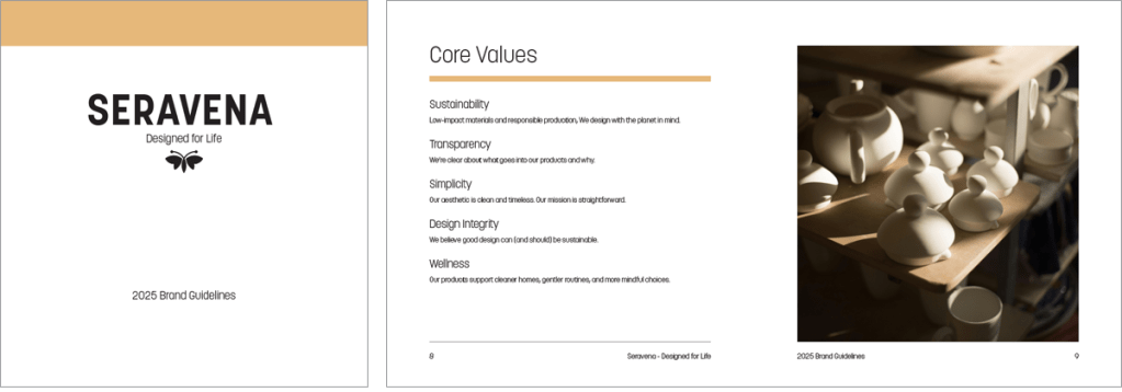
- Core values emerged: Sustainability, Simplicity, Wellness, Transparency, and Design Integrity
These insights directly informed the design language, tone, and overall brand positioning.
Logo Development
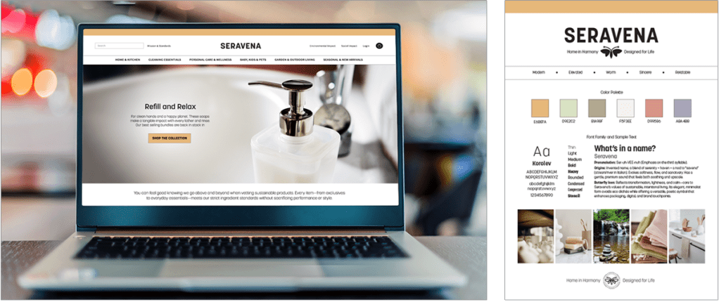
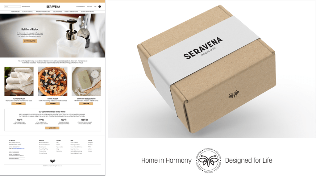
The invented name Seravena (Pronunced Ser-uh-VEE-nuh with emphasis on the third syllable) was inspired by the concepts of serenity and haven, and the idea of home as a refuge, weaving together themes of peace, protection, and everyday beauty. The Seravena logo centers on an elegant, custom wordmark paired with a minimalist icon of a butterfly in flight. The butterfly was chosen as a symbol of transformation, grace, and lightness—offering a quiet metaphor for intentional living. Its abstract form feels elevated and timeless, steering clear of literal “green” visual clichés.
Color & Typography
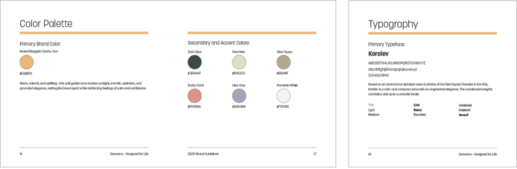
Seravena’s primary brand color—a warm, muted saffron—was selected to bring distinction to a market often dominated by greens and neutrals. The tone feels refined, tactile, and human—offering emotional warmth while still aligning with a minimalist visual system.
Typography plays a crucial role in establishing tone. I selected a geometric sans-serif with soft curves and strong structure. It offers a modern, approachable feel with excellent legibility across digital and print touchpoints.
Brand Guidelines & Toolkit
Building on the visual identity, I developed an expansive set of brand guidelines that included:
- Core Values – Anchoring all messaging and creative decisions
- Brand Personality – Modern, sincere, warm, and quietly confident
- Color Palette – Earthy neutrals paired with expressive accent tones
- Typography – Hierarchy and usage guidelines for digital and print
- Voice & Tone – Style principles and writing guidance for consistent, brand-right messaging
- Iconography & Photography – Visual language, textures, and style references
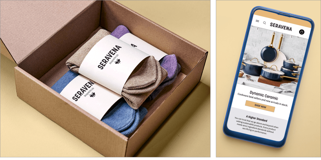
- Applications – Logo usage, social templates, packaging mockups, and campaign-ready assets
These tools were designed to ensure consistency across brand touchpoints—from e-commerce and social media to product packaging and retail environments.
Outcome
A cohesive brand foundation that is both flexible and distinct—allowing stakeholders to confidently build campaigns, launch products, and scale presence without sacrificing visual or strategic integrity.
The brand stands apart in a crowded space by offering a message of elegance, intention, and conscious design—delivered through a refined and resonant visual system.
*This execution is a simulated project produced to showcase my process, approach, and execution of a visual identity and brand development assignment.
