Editorial Design
Client: Various Magazines and Periodicals
Role: Creative Director
For five years, I served as the lead designer for a nationally distributed health magazine—overseeing layout and design across both its quarterly print edition and its digital counterpart, published in English and Spanish. I was part of the core team that developed and launched the magazine’s award-winning digital platform. In addition to art direction and layout, I also led online editorial production and asset management.
That experience taught me the intricacies of working across print and digital formats, designing for clarity and accessibility, and building compelling editorial packages that balance visual interest with easy comprehension. My approach to designing this type of content emphasizes clean, reader-friendly grids and layouts, strong typographic hierarchy, and thoughtful use of imagery and white space.
Below are some original editorial layouts. Each example reflects my ability to tailor design to tone, audience, and content.*

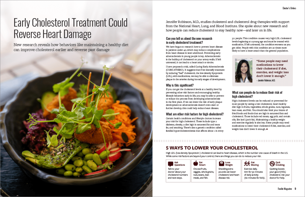
Feature: Early Cholesterol Treatment Could Reverse Heart Damage
Publication: Foodie Magazine
View this layout as a pdf
This full-spread is an installment of the “Doctor’s Orders” section of Foodie Magazine, a culinary-focused publication with a science and wellness lens. The feature includes a Q&A with a leading researcher studying early cholesterol treatment, followed by some expert advice.
The layout invites the reader in with warm, intimate photography. A clear, modular grid ensures seamless flow from interview to list. I paired a condensed humanist typeface for the headlines with a sturdy slab serif for body copy, creating a modern aesthetic that’s easy to read. Custom icons enhance the list section, helping readers quickly absorb key takeaways.

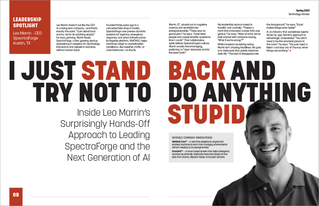
Feature: Leadership Spotlight – Against The Grain
Publication: Technology Review
View this layout as a pdf
This feature breaks traditional layout conventions to spotlight a CEO shaking up the tech world. Designed for Technology Review, the layout plays with scale, placement, and form—without sacrificing clarity.
The print version of the publication allows more freedom from strict accessibility requirements, which gave me room to explore bold typography and asymmetrical design. A dramatic, oversized headline paired with a sharply engineered typeface delivers visual tension, while careful spacing and hierarchy keep the layout readable. Strategic placement of text blocks challenges the norm while guiding the eye through the story.
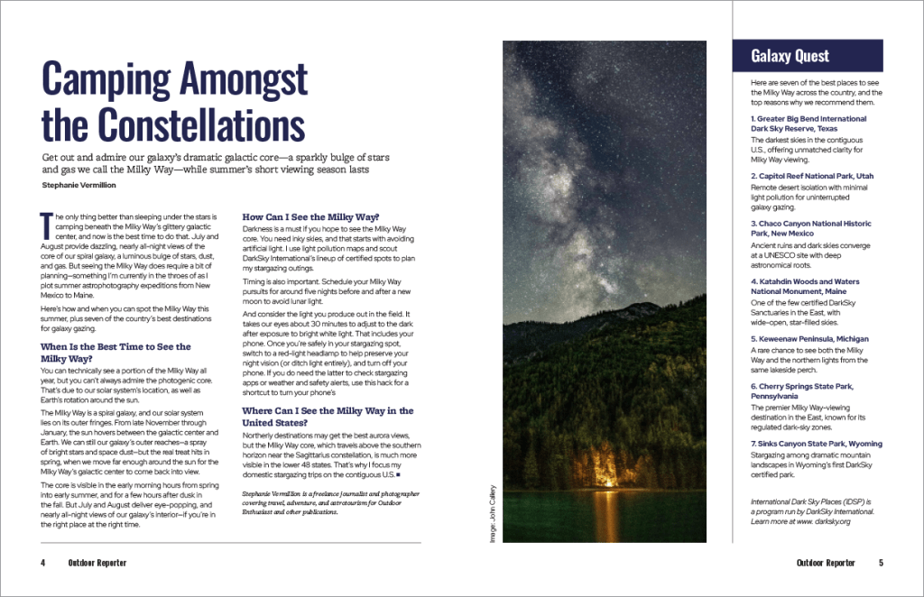
Feature: Camping Under the Milky Way
Publication: Outdoor Reporter
View this layout as a pdf
This feature invites readers to explore the night sky’s most breathtaking seasonal display—the Milky Way like you’ve never seen it before. Published in Outdoor Reporter, a travel and adventure journal with a classic and understated feel, the article outlines seven top U.S. locations to catch a glimpse of the summer spectacle.
The layout leverages a mix of serif and sans-serif fonts to build visual contrast and guide navigation. A strong vertical hierarchy and clean grid structure organize the content, and a stunning photograph captures attention and sets the tone.

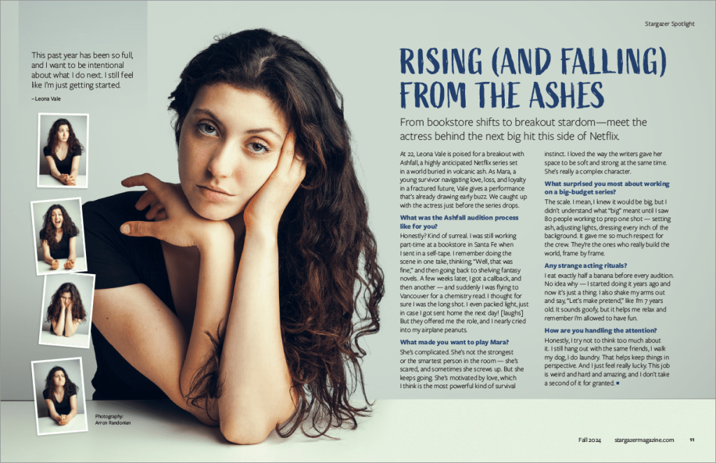
Feature: Rising and Falling From the Ashes: A Conversation with Leona Vale
Publication: Stargazer Magazine
View this layout as a pdf
Designed for a pop culture and arts magazine that profiles emerging creatives, this feature showcases a playful Q&A with a young actress leading an anticipated Netflix release. The tone is light, the imagery bold, and the layout is designed to feel fresh and inviting.
A brushed-style headline font conveys energy and personality, while subheads and body copy are set in a super-clean sans serif with varied weights for contrast and flow. The design frames the actress’s studio portrait in a way that gives it visual dominance, anchoring the page and supporting the article’s breezy, personality-driven tone.
*Note: The publications and editorial content showcased on this page were developed as portfolio demonstrations. Some people, topics, and details have been invented or adapted to simulate real-world editorial assignments.
