Aterra Brand Identity
Client: Aterra
Project: Visual Identity + Brand Guidelines Development
Role: Brand Designer / Creative Director
Project Background
Aterra is a Direct-to-Consumer (DTC) startup offering sustainable, aesthetically elevated home goods—from bamboo dishware and refillable cleaners to organic linens and utility staples for modern living. Their target audience includes Millennial and Gen Z consumers, primarily women, who value eco-consciousness without sacrificing design.
Their key competitors include brands like Grove Collaborative and Package Free—companies that have helped build awareness around low-waste living but lean heavily toward functional or utilitarian aesthetics. The client saw a clear opportunity to own the intersection between sustainability and style, offering products that are ethically made, plastic-free, and visually refined.
To succeed in a competitive space, they needed a brand identity that was distinctive, versatile, and emotionally resonant—supported by a comprehensive set of brand guidelines that could be used across packaging, web, social, and physical environments.
Discovery & Brand Positioning
We began with a brand discovery workshop designed to define the company’s purpose, values, audience, and personality. This collaborative exercise revealed several key insights:
- Consumers are overwhelmed by choice and sustainability jargon—they want simplicity and trust.
- Aterra’s opportunity lies in feeling different—warmer and more refined than the typical “green” brand.
- The brand should reflect natural ease, quiet confidence, and modern aesthetics—not preachiness or performative virtue.
- The name itself—Aterra, derived from “terra” (Latin for “earth”)—offered a clear conceptual anchor: grounded, balanced, organic beauty.
These takeaways formed the foundation for all creative decisions, from the brand name and color strategy to typography, tone, and iconography.
Logo Development
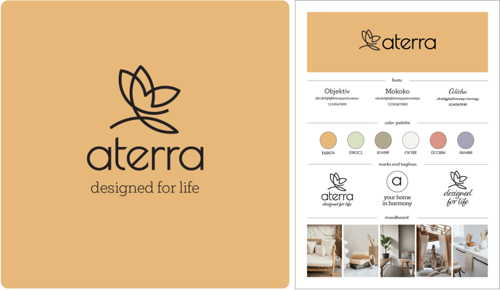
The Aterra logo was designed to express clarity, warmth, and quiet confidence. The wordmark features a set of refined lowercase letter-forms that reflect the brand’s balance of simplicity and sophistication. It is paired with a custom icon, drawn from a single continuous line to represent both a butterfly in flight AND a blossoming flower—a dual metaphor for transformation and growth through nature. This line-based motif reinforces the brand’s focus on graceful minimalism and serves as a versatile asset across packaging, digital, and print applications.
Color Palette
Aterra’s primary brand color is Muted Marigold (#E6B87A)—a warm, underutilized hue in the eco-home category, where deep greens and teals dominate. This soft golden tone evokes natural light, optimism, and grounded elegance, setting the brand apart while reinforcing feelings of calm and confidence.
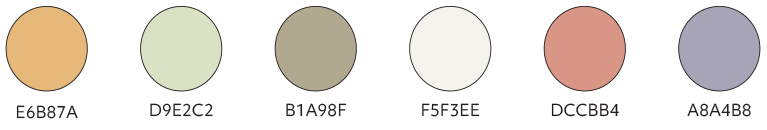
The supporting palette is soft, neutral, and versatile—designed to evoke balance, ease, and modern simplicity. Together, these colors support a brand experience that’s natural, calm, and design-forward.
Brand Guidelines
To support future growth, I developed a brand guideline system covering every core element including core values, brand personality, and voice. We articulated a brand voice that is: warm, but clear; confident, but never pushy; sincere, but never preachy. Sample tone guidelines were developed for homepage copy, packaging, product pages, and social content—ensuring a cohesive and inviting brand presence across every touchpoint.
Typography
The type system pairs the humanist sans-serif used in the logo with a soft, editorial serif for headlines and print applications—creating a blend of modernity and warmth that supports both storytelling and clarity.

Impact
The result is a brand identity that differentiates Aterra in a crowded market—not just by what it sells, but by how it makes people feel: calm, inspired, and empowered to make better choices.
From digital design systems to packaging and campaign-ready messaging, the guidelines now serve as a scalable toolkit for building a unified brand experience—grounded in values, elevated in style, and positioned to grow.
