AAA Direct Mailers
Role: Senior Art Director (as an agent of Blue Duck – formerly Direct Associates, Boston MA)
Scope: Concept and Layout design, Graphic Illustration, Image Editing, Marketing Collateral, Direct Mail
The Assignment: Deliver two fully-executed concepts for a direct-mail piece announcing a membership upgrade offer.
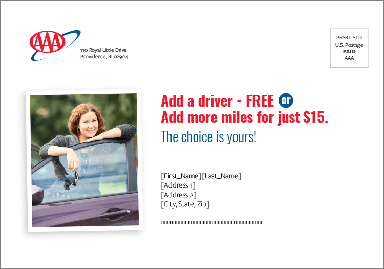
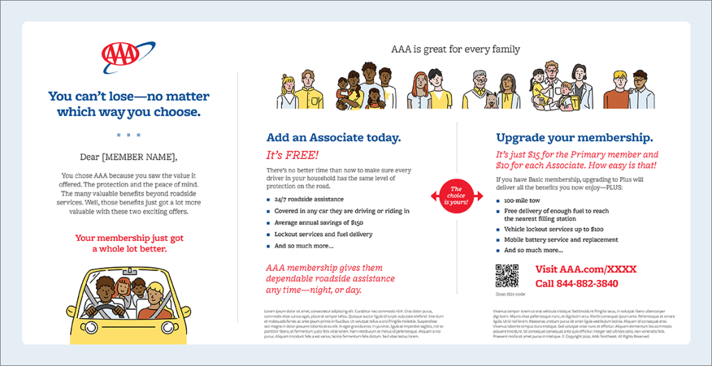
Concept 1 – Customization
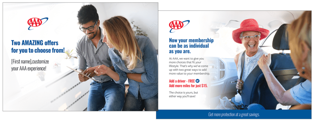
Concept: AAA is not a one-size-fits-all membership. Now, members can choose between two compelling offers tailored to their individual needs and lifestyles. Each option delivers added savings and benefits, along with the flexibility to use AAA in a way that works best for them—enhancing the overall value of membership. At its core, this campaign reinforces AAA’s commitment to personalized service and member choice.
Execution: Building on the client’s past success with coupons, we developed a tri-fold mailer featuring a tear-out component to drive engagement. Clean, vibrant photography paired with AAA’s distinctive branding ensured instant recognition among members. Strategic use of color and typographic hierarchy helped organize the content clearly and highlight key benefits. Imagery was carefully curated to represent the diversity of AAA’s customer base, reinforcing the message that this is a membership made for everyone.

Cover
Back

Reveal

Inside

Outside
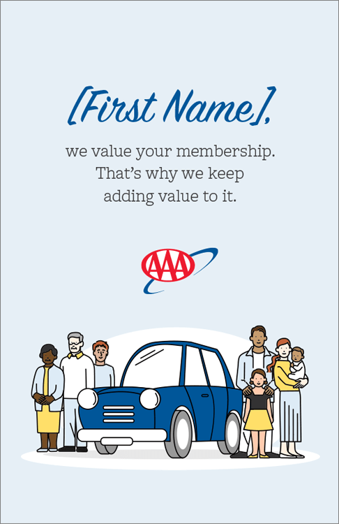
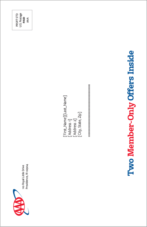
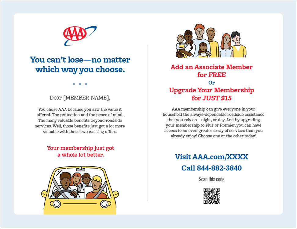
Concept 2 – Value
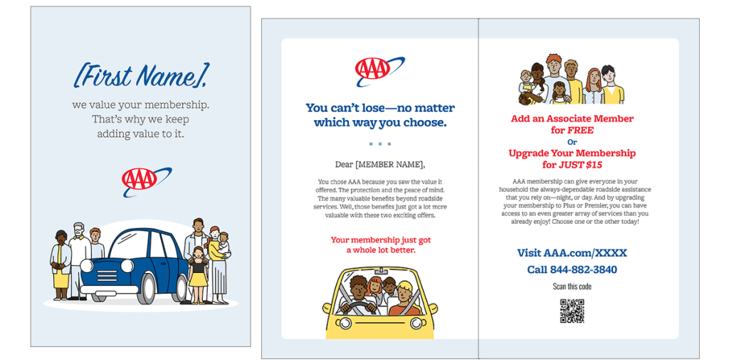
Concept: Members choose AAA because of the value it delivers—well beyond roadside assistance. To recognize that loyalty, we’ve added even more value through two tailored offers. Each one is designed to enhance the member experience, offering greater savings and flexibility. This campaign emphasizes AAA’s ongoing commitment to putting members first and delivering benefits that match their needs.
Execution: This execution relied on the strength of the offer itself, with text as the primary vehicle for communication. Friendly, graphic-style illustrations representing the diverse members served as decorative support while reinforcing inclusivity. The mailer opens with a personalized message—each recipient’s name is dynamically inserted during production, becoming the headline and setting a conversational tone. A vertical, column-based layout organizes the content for easy navigation, while varied text weights and styles guide the reader through key details. The piece closes with strong, clear calls to action that drive engagement.
Cover
Back
Reveal
Inside
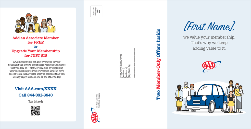
Outside
